
KUSAKA LABのロゴの作成 ”Creating the logo for KUSAKA LAB.”
【English follows after Japanese】
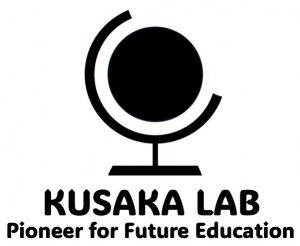
修士1年生の関谷和生さんが、生成AIを活用して日下研究室のロゴを作ってくれました。Facebookやインスタなど日下研究室のSNSのアイコンをすべてこのロゴに変更します。このロゴには以下の意味があります。
◎円は幾何学的な形状として多くの象徴的な意味を持ちます。中央の円は、知識や真実を明らかにする研究の透明性と明瞭さを象徴しており、研究室が特に透明性や真実追究に価値を置いていることを示しています。
◎円の外にある曲線は、この円を優しく抱きしめており、研究室全体で協力し、メンバーをサポートし、共に成長することを意味しています。
◎また、この円は部分的に解放されており、誰にでもオープンで、社会に開かれた研究室の開放性を示しています。
◎さらに、曲線の形状は「C」の文字を連想させ、「コミュニケーション」、「コラボレーション」、「クリエイティビティ」をモットーとして取り組んでいきます。
実はこの意味も、このロゴを生成AI読み込ませ、生成AIが考えました。我々が何となく意識していたことを明確に言語化してくれたともいえます。他方で、最初から特に強い思い、信念、モチベーションがあるわけでもなく、とりあえずやってみて、後から生成AIが(もしくは自分が)理由付けし、なるほどと納得して、後付でそれを目指すというのも、これからの時代重要ではないでしょうか。我々は、上記に示したようなコミュニティ集団に少しでも近づけるよう日々精進してまいります。
Mr. Kazunari Sekiya, a first-year master’s student, created this logo using generative AI for Kusaka lab. The logo will be updated across all Kusaka Laboratory’s social media platforms, such as Facebook and Instagram, to unify our digital presence. This logo carries a range of symbolic meanings associated with its geometric shape.
◎The central circle represents the transparency and clarity of research that reveals knowledge and truth, demonstrating the lab’s commitment to openness and the pursuit of truth.
◎The curves surrounding the circle gently embrace it, signifying the collaborative spirit, the support among members, and our collective growth.
◎Additionally, the circle being partially open represents the lab’s accessibility to everyone, highlighting our openness to society.
◎The shape of the curves evokes the letter ‘C,’ reflecting our dedication to ‘Communication,’ ‘Collaboration,’ and ‘Creativity’ as our guiding principles.
Actually, the meaning behind this logo was developed by a generative AI as well. It could be said that the AI helped us articulate what we were subconsciously aware of. On the other hand, even though it wasn’t that we had a particularly strong belief or motivation from the beginning, we just tried things out, then had the AI give us reasons for the design afterwards, which we found convincing. It’s a sense-making and purpose-finding that seems to align well with the fluid and dynamic nature of the times we live in. Anyway, we will continue to work diligently every day to become the community represented this logo!!


